Knock Down the Walls to Create a Bank Canvas
As the saying goes, “You can’t see the forest for the trees.” I see this dynamic when remodeling homes where existing walls and other assumptions limit the vision of what can be done. It’s not just that most people can’t visualize or haven’t the experience of reconfiguring rooms, sometimes it is simply too hard to grasp a three dimensional space and the potential for change.
The solution is to draw up plans and get an overview of the floor plan. The next step is to eliminate all but the exterior walls to create a blank canvas. It is amazing what new possibilities present themselves when preconceived notions are set aside. This could be considered an analogy for life in general, I think.

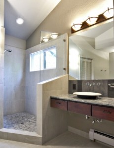
Walk-in shower is partially enclosed by sloped half wall. Thick glass partition controls shower spray without adding structure. Cherry vanity floats from wall to wall with plate mirror above.
The challenge was to transform a master bath in a Alta Sierra home built in the eighties. The homeowners had challenged me at the beginning of the project to do more than simply update the bath. They wanted something artistic and out of the ordinary.
The original bath was chopped up into small cubicles. A high vaulted ceiling combined with the small spaces resulted in tall dark “tunnels” lit by dated swag-mounted lighting. The doorway from the bedroom forced all foot traffic between the sink and opposite vanity leaving little room to pass. Although a generous closet flanked the rear wall, the hallway in front was largely wasted space. Most odd of all was the doorway into the adjacent bath where a tub/shower was shared with guests. The master bath had no bathing facility of it’s own.
As we developed the design some constraints need to be considered. The bathroom was on the second story. Moving the toilet would have been difficult and disruptive to the living space below. We designed the new bath around the existing toilet location to work with this limitation and to save costs. The end result was a plan for a spacious bathroom with interesting angles that was created by knocking down a number of partition walls.

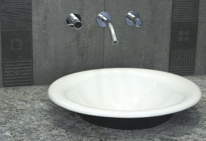
Kohler Iron Bell sink sits on granite slab countertop with wall-mounted Kohler Stillness faucet. Deco tile details on backsplash add just the right touch.
One key element in the new bath is the vanity with vessel sink. The cabinet is only a foot thick including the drawers and “floats” from wall to wall. The counter is a granite slab with a Kohler Iron Bell sink. The Kohler Stillness faucet is mounted in the tile splash that has Zen-like black engraved deco tiles. It’s a beautiful combination of function and art.
We also installed a 36” high cherry cabinet with granite top to shield the toilet and provide additional storage. The original design called for a 42” high cabinet which looked ok on the drawings but in real life was too big, so we ordered a second cabinet to fit the room.

Moen Asceri valve allows transfer from fixed showerhead to Grohe personal shower with slide bar. Note: pebble accent strip in corner with cubby.
The signature piece of the room is the walk-in shower. It is partially enclosed by a half wall wrapped in ceramic tile with a ½” thick trapezoid glass panel on top. The glass is thick enough to be mounted without a supporting frame and looks spectacular standing free of any structure. The shower is bright and well lit with a new vinyl frame window installed at just the right height for a view but without compromising privacy.
The shower has dual showerheads that are controlled by a Moen Asceri transfer valve, which allows temperature control and adjusts water flow to two locations. The shower features a Grohe personal shower with slide bar and a corner-mounted fixed showerhead.
The shower has large wall tiles that were chosen for ease of cleaning. The pebble floor is made of real stone and provides plenty of safe traction. We ran an accent strip of pebbles up the corner to meet the wall cubby for shampoo storage. A tile seat spans the corner and provides a useful function. The rest of the bathroom flooring matches the wall tiles.
A walk-in closet fills the rest of the room with lots of to shelves and cubbies provide adequate storage to replace the ten feet of closet that was lost during the remodel. The closet flooring is light bamboo floor that is warm underfoot and looks great against the tile floor of the bath.
The finished space offers an interesting open view with subtle angles on the ceiling, walls and partitions. The closet wall is angled similar to the slope of the shower wall. The eye picks up small repetitive details like this, which brings a pleasing overall feeling to the space.
The newly remodeled space is several months old now and has become a part of the home. The owners report that shower is very easy to maintain without an enclosure to keep clean. They shared with me that the enjoyment of using the new space is something they appreciate every day. That is the part of my job I like the best, when the finished project has successfully enhanced the quality of life for my client.
Andrew Wright, CR is a regional and national award winning remodeler and a member of the National Association of the Remodeling Industry and the National Kitchen & Bath Association. He may be reached at WrightBuilt Home Remodel & Design at 272-6657.


